Donald Trump has launched an all-out trade war with China. I have given up on keeping track on where the tariffs stand now, but so far China has decided to play along with the chicken game and retaliate. Adam Posen has an excellent piece in Foreign Affairs on how China may have a structural advantage in this game because - as China is a big exporter to the US while the US exports much less to China - it’s going to be easier for China to find other markets for their products than for the US to find other places that can supply the things that China makes, as Jonathan Hopkin remarked. Moreover, what China would lose if it lost the possibility to export to the US is money: money is fungible and could be cushioned by China’s large excess savings. What the US would lose if trade with China were to stop is products, some of them irreplaceable, such as rare earth materials and the like. Not fungible.
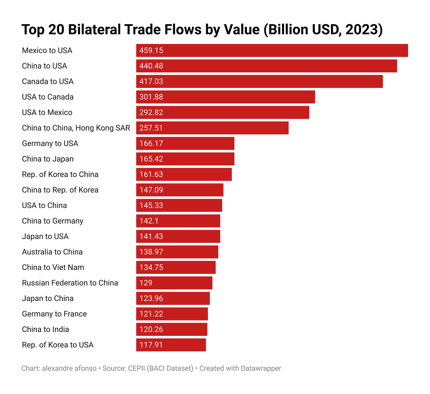
One very basic way to understand how disruptive the tariffs would be is just to look at the largest bilateral trade flows by value (source below). The 3 largest bilateral flows in the world go to the US.
But beyond this, it’s hard to get a clear picture of how global trade really works and how these tariffs would effectively disrupt the world economy as a system. Who trades with whom, and at what scale? What do these flows actually look like?
I’ve been digging into trade data and experimenting with social network analysis. By visualizing global trade as a network—based on actual bilateral flows—it’s possible to better understand how tariffs risk disrupting actual trade flows. In other words, the pause announced by Trump on all the tariffs he was planning last week seem like good news, but we may still be very screwed. Social network analysis offers a powerful lens to make sense of this. It not only generates pretty graphs, but also provides quantitative metrics that help identify the relative importance of countries in the global trading system. It shows not just trade volumes, but also the strategic positions of countries within the network. Nations that frequently appear in others’ top trading relationships wield structural influence in global trade.
I have been using the most recent data (2023) available from the CEPII BACI dataset, which provides harmonized and highly detailed bilateral trade data for goods. I applied two filters to this dataset:
Top Destinations (Figure 2): For each exporting country, I ranked bilateral trade flows for all goods by value and kept only the top three destinations.
Top Suppliers (Figure 3): For each importing country, I ranked import sources by value and kept only the top three suppliers.
I then visualized the resulting networks using Gephi, an open-source social network analysis tool. Countries are represented as nodes, and trade flows appear as directed edges, scaled by trade value.
This first network graph shows the biggest “buyers” in the world trade system. Nodes represent countries. Directed edges point toward top export destinations, scaled by trade value.
A few key insights:
The United States is the most frequent top-3 export destination, appearing in 90 bilateral relationships. In other words, about half the countries in the world count the U.S. among their main export markets.
China follows closely, appearing 80 times. As a major consumer and a key hub in global value chains, it imports a wide array of goods—often as intermediate inputs for further transformation and re-export. It buys a lot, but sells even more. The US is the other way around.
Regional patterns are visible: the largest bilateral trade flow globally is from Mexico to the U.S., followed by China to the U.S. This highlights America's central role in both regional and global demand. Germany is clearly the biggest player in Europe. Note that Africa is almost invisible in the graph.
In this visualization, node size reflects the total value of incoming trade, underscoring the demand-side centrality of countries like the U.S. and China.
This second network graph, instead of the biggest importers, shows the biggest exporters. Here, China is bigger than the US.
A few standout patterns:
China is by far the most frequent top-3 supplier, appearing 169 times—more than twice as often as the U.S. (71 times). So about 86% of countries around the world have China as one of their top-3 suppliers. This is quite staggering. We knew this, but China is the factory of the world.
China’s node is the most connected and dense, illustrating its high out-degree centrality in the global supply chain.
Key trade partners include the U.S., ASEAN members, Japan, and European countries—evidence of China’s integration across multiple regional networks.
One of the key takeaways from these graphs is the profound economic interdependence between the U.S. and China. Each features prominently in the other’s top trading relationships, both as buyers and suppliers. However, the balance is asymmetric: the U.S. is a major buyer of Chinese goods, while China is a much larger supplier than it is a customer for U.S. products. It's worth noting that these figures cover goods only; the picture would look different if services were included, as the U.S. exports a significant volume of services abroad. Despite increasing rhetoric around “decoupling,” the underlying trade data highlights how slow, complex, and potentially disruptive such a shift would be.


Perhaps more can be squeezed out of these graphs. For instance, one might use the same networks to determine where trade will shift if the major US ties are severed or capped at a certain size.
What the networks will miss, however, is the intensification of intra-country trade (so technically, self-ties in the represented graphs). In comparison to the EU, Canada is very lowly economically integrated between its 'sub-nodes' (provinces). Perhaps there's some potential there that the graph will fail to capture.