#8 Education and the electoral geography of the radical right in the Netherlands
The educational profile of the population is the most important explanation of why Wilders did better in some places than in others in this week's elections.
On Wednesday, November 22nd, the elections for the Dutch lower chamber delivered a surprising victory for veteran far-right leader Geert Wilders. His Party for Freedom (Partij voor de Vrijheid) doubled its seat share, emerging as the largest party in Dutch history for the first time. Wilders will now endeavor to form a coalition government—an arduous task in the Dutch fragmented party system. As a reminder: the Netherlands has an extremely proportional electoral system with only one electoral district, which means that a party only needs 0,67% of the vote to obtain a seat in the Lower House.
How can we explain why Wilders did better in some places rather than others? I got hold of data on the electoral score of each party in each municipality in this week’s election and correlated it with data I had used in the past from the Dutch statistics office, encompassing various social and demographic indicators. This allows for a glimpse into the factors that explain why Wilders garnered more support in some areas.
Beginning with the straightforward visualization above —a map depicting the electoral scores akin to a thermometer: areas shaded in blue (cold) indicate voting below the national average for the PVV, while “warm” red areas denote greater support than average. Dark blue areas encompass larger cities, particularly those with universities (such as Amsterdam, Rotterdam, Utrecht, Leiden, and Groningen), where the PVV performed well below average. Conversely, it gained substantial traction in Limburg in the South-East (Wilders’s home region) and the peripheral North-East.
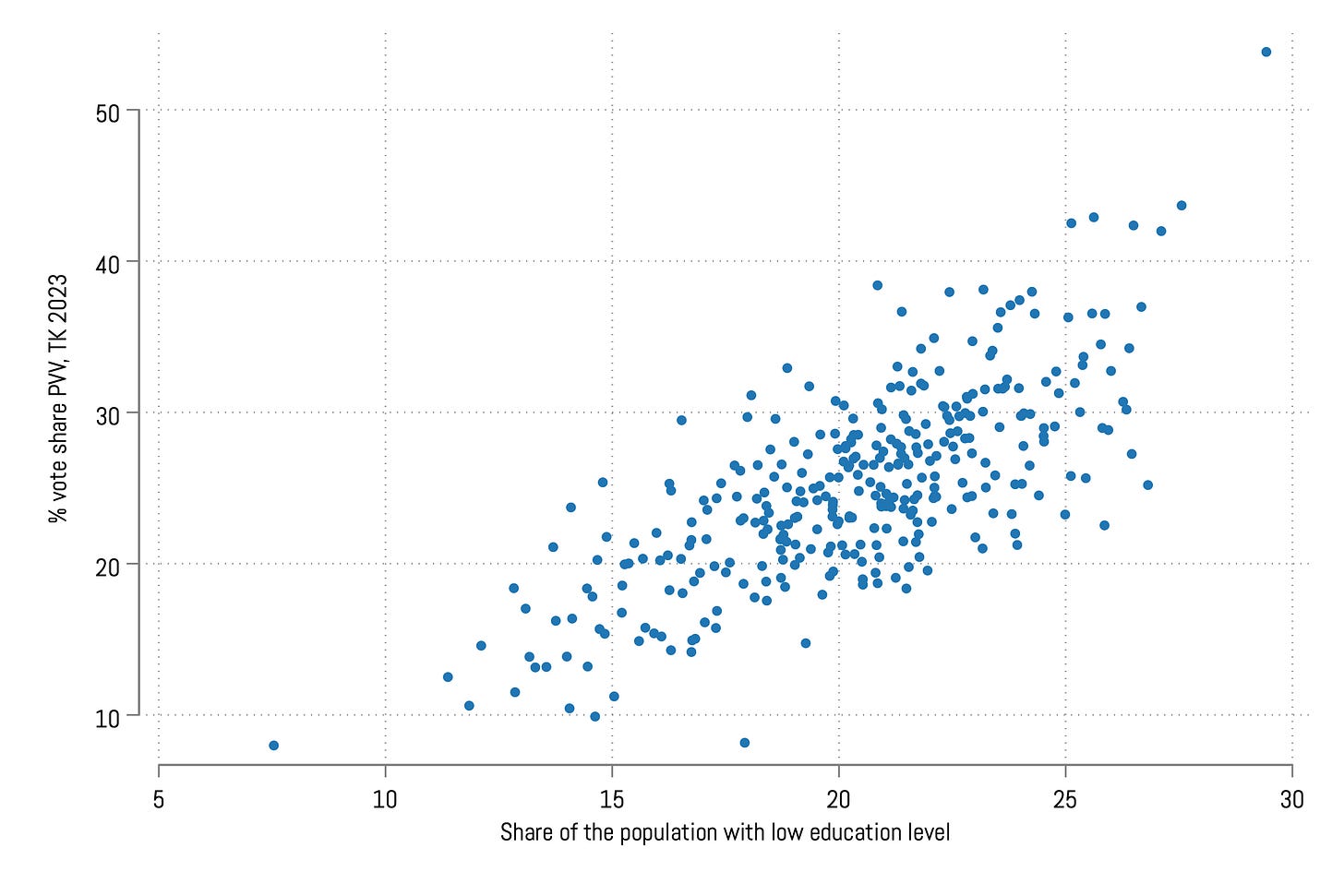
Let's now examine the correlation between the PVV vote share and some demographic and socio-economic indicators. As we have previously mentioned education and universities, the Dutch statistical bureau (CBS) provides data on the educational composition of the population in each municipality. To be direct: this factor is the most significant predictor of the PVV vote share, as illustrated in the scatterplot below.
The horizontal axis represents the percentage of the population in each municipality with what the CBS defines as a low education level (primary schooling, vmbo, the first 3 years of havo/vwo, or mbo 1 in the Dutch system). This relationship exhibits an R-square value of .54, indicating that 54% of the variation in the PVV vote share across municipalities can be accounted for by this variable. This aligns with what we knew of the PVV electorate from previous research, but the correlation here is still quite striking:
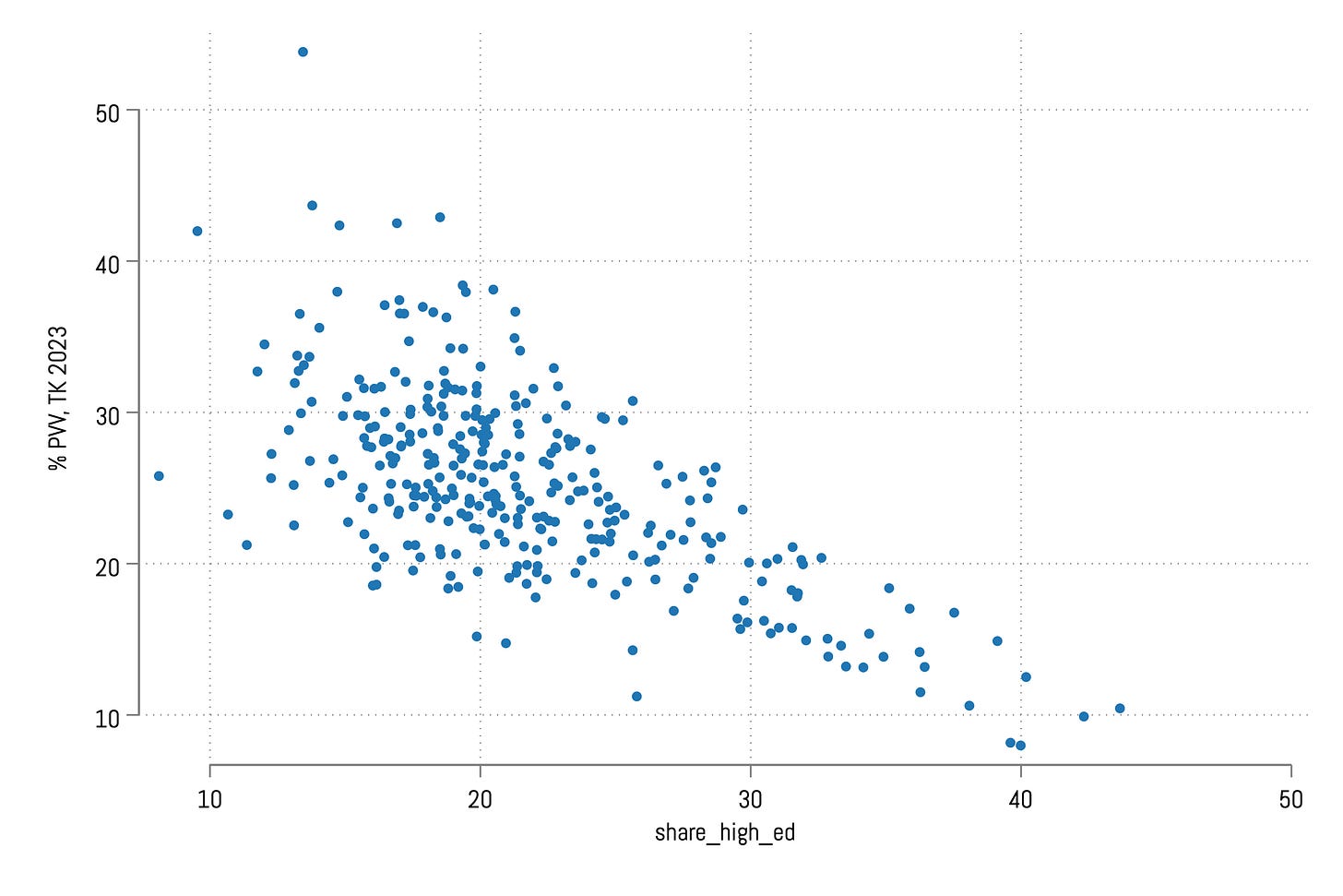
Naturally, the relationship is reversed when we take the percentage of highly educated individuals in each municipality:
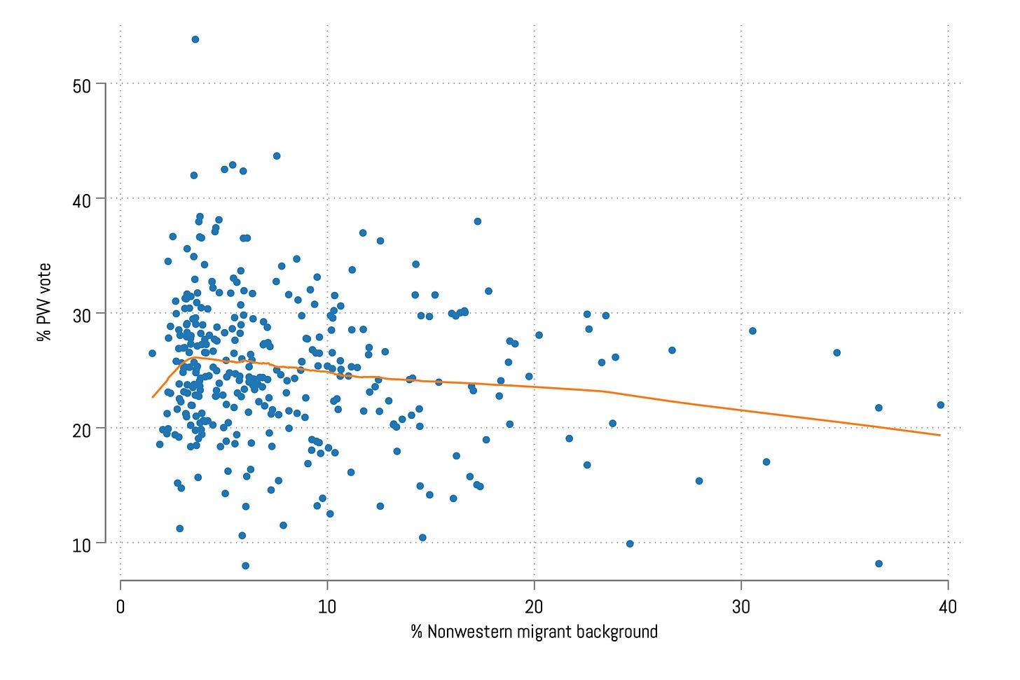
What happens if we look at the relationship between the PVV vote share and the percentage of individuals with a migration background, especially non-Western, which are the target of Wilders’s discourse? The CBS also has data on this but the results are much less clear than the education story above. On average, places with a greater share of people with a non-Western migration background have a lower vote share for the PVV. The correlation here is not very strong.
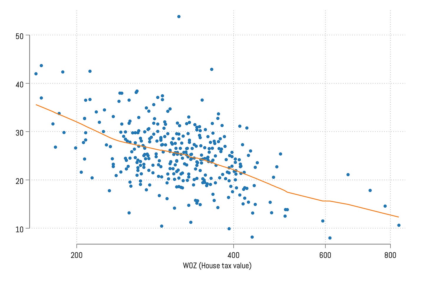
Let's delve into one final variable that correlates with the PVV vote share. As observed in the initial map, peripheral regions appeared to exhibit higher levels of support for Wilders's party. A somewhat rudimentary approach to gauge the peripherality of a location is examining house prices: central areas, equipped with infrastructure and amenities, typically experience greater competition for space, resulting in higher property values. In contrast, peripheral regions, with fewer facilities, often witness lower competition, reflecting in lower property values. The Dutch statistical office provides data on the average tax value of properties—distinct from exact house prices (usually lower)—it offers insight into the average property values in specific areas. Once again, a clear negative correlation is visible (the x-axis has been logged), indicating that the PVV garners more support in areas with lower property values. This indicator probably aligns with other indicators of geographical deprivation.
